
TL;DR:
- Stock heat maps visually represent market-wide performance using color-coded tiles for quick analysis.
- Interpreting color signals and sector trends helps investors identify emerging opportunities and risks.
- Customized filters and real-time data enhance decision-making beyond basic heat map views.
Most investors spend hours scanning individual price charts, line by line, stock by stock, missing what a single screen can reveal in seconds. The reality is that conventional charts are excellent for tracking one position over time, but they tell you almost nothing about where the broader market is moving right now. Stock heat maps solve this problem by displaying hundreds of stocks and sectors simultaneously, using color to communicate what would otherwise take hours of manual analysis. This article walks you through what heat maps are, how to read them accurately, and how to translate their signals into real buy, hold, and sell decisions.
Key Takeaways
| Point | Details |
|---|---|
| Instant market overview | Stock heat maps provide a visual summary of sector and stock performance at a glance. |
| Color-coded insights | Color zones signal momentum, sector rotation, and outlier stocks for faster decision-making. |
| Supports active investing | Heat maps help investors quickly identify buying and selling opportunities based on real-time trends. |
| Platform customization | Most tools allow filtering by sector, index, and activity level for more focused analysis. |
What is a stock heat map?
A stock heat map is a visual representation of market data in which individual stocks and entire sectors are displayed as color-coded tiles. As Tickerplace explains, "stock heat maps visualize market data using color-coded sectors and stocks," giving investors an instant snapshot of market-wide performance without scrolling through dozens of individual charts.
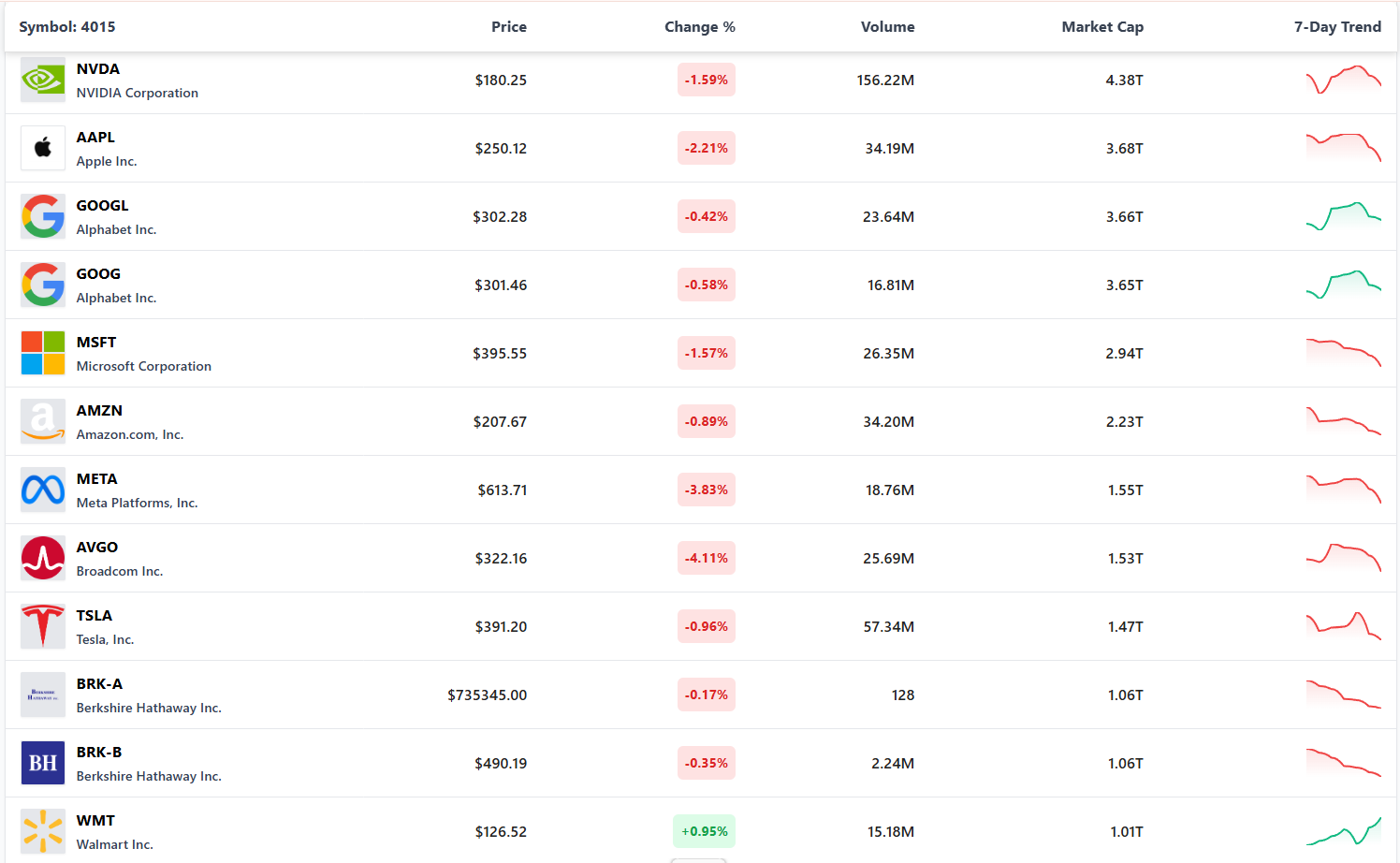
The layout typically follows a hierarchy: broad market sectors such as technology, energy, financials, and consumer discretionary are grouped together, and within each sector, individual company tickers appear as smaller tiles. The size of each tile usually represents a company's market capitalization, meaning larger companies like Apple or Microsoft occupy more visual space than smaller-cap peers. This structure lets you compare sector weight and individual stock performance simultaneously.
"A heat map does not replace deep analysis, but it dramatically shortens the time needed to locate where market attention is concentrated on any given session."
Key elements found in every heat map include:
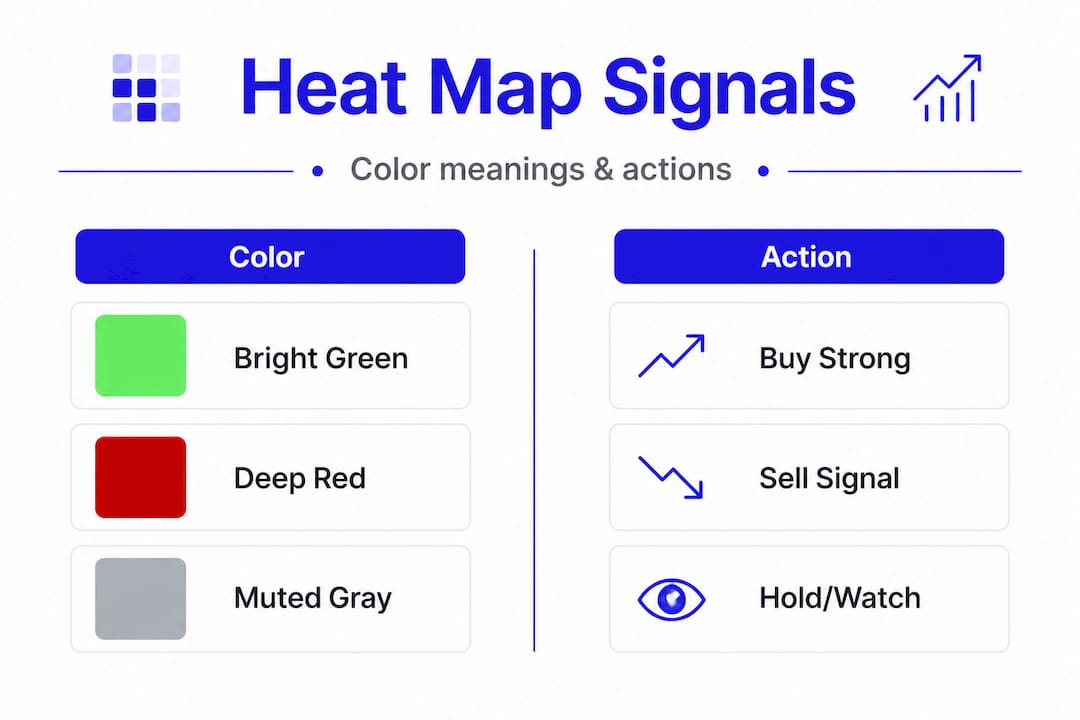
- Color intensity: Darker shades of green indicate stronger percentage gains, while darker red signals steeper losses
- Tile size: Reflects market cap weighting, giving you a sense of where institutional money is concentrated
- Sector grouping: Organizes stocks so you can compare performance within an industry at a glance
- Percentage labels: Most platforms display the exact gain or loss figure directly on each tile
Understanding reading market data through a heat map is one of the fastest skills you can develop as an active investor. Once you recognize the structure, interpreting a session's activity takes less than two minutes.
How to interpret stock heat maps
With a clear understanding of what a stock heat map shows, it's time to learn how to read and act on its visual signals. Heat maps use green, red, and gray to visualize market movements across sectors and stocks, and each color carries a specific meaning that informs your next move.
Here is a step-by-step approach to reading heat map signals effectively:
- Start with the sector overview. Before focusing on individual stocks, scan the full map for dominant colors. If technology and healthcare are broadly green while energy is red, that tells you where momentum is flowing.
- Identify the brightest tiles. Bright, saturated green tiles represent the day's top performers. These stocks are drawing volume and momentum, which warrants closer examination.
- Look for outliers within weak sectors. A green stock inside a predominantly red sector can signal unusual strength or a potential rotation play.
- Check gray tiles. Gray or muted tiles indicate low trading activity or negligible price change. These stocks are not participating in the day's movement and may be worth monitoring rather than trading.
- Use the heat map as a filter, not a final answer. Once you spot a candidate, move to evaluating stock performance metrics like earnings growth, debt levels, and price-to-earnings ratios to build conviction.
Here is a sample breakdown of how color codes translate into sector context:
| Color | Signal | Typical Action |
|---|---|---|
| Bright green | Strong gains, high momentum | Research for potential entry |
| Light green | Modest gains, moderate interest | Watch and monitor |
| Gray | Flat or minimal movement | Hold or observe |
| Light red | Modest losses, low selling pressure | Reassess fundamentals |
| Bright red | Heavy losses, selling momentum | Consider exit or avoid |
Pro Tip: Watch for clusters of color change sweeping across a sector over two to three sessions. This pattern often signals a shift in institutional sentiment before major news headlines confirm it. Using an average price calculator alongside heat map data helps you decide whether adding to a position during a pullback makes sense.
Using stock heat maps for decision-making
Once you know how to interpret heat maps, it's crucial to understand how to use them for concrete investment actions. According to market research, investors use heat maps to spot outperforming stocks and weakness across sectors, which directly supports better-timed buy and sell decisions.
Identifying buy candidates:
- Look for stocks showing persistent green across multiple sessions, especially if the broader sector is also trending positive
- Confirm that the company's fundamentals support the price action before committing capital
- Use heat map platforms with filtering options to narrow results by market cap, volume, or sector before drilling deeper
Spotting warning signs:
- A stock that turns red while its sector remains green is often a company-specific issue worth investigating immediately
- Broad sector red signals may point to macroeconomic pressures, such as rising interest rates affecting financial stocks
- Sustained gray tiles may indicate fading interest, which often precedes a sharper directional move
Consider how heat map signals translate for three hypothetical stocks:
| Stock | Heat map color | Sector trend | Suggested action |
|---|---|---|---|
| Stock A | Bright green | Sector green | Research for entry |
| Stock B | Light red | Sector neutral | Hold, monitor earnings |
| Stock C | Bright red | Sector red | Review thesis, consider exit |
Using stock filters in tandem with heat map data is particularly powerful. Filters let you eliminate noise by setting thresholds for volume, percentage change, or price range before the heat map even loads. This means the tiles you see are already pre-qualified candidates, saving substantial research time.

Pro Tip: Never rely on heat map color alone to execute a trade. Combine the visual signal with fundamental analysis, including revenue trends, margin direction, and sector tailwinds, for higher-conviction decisions with lower regret.
Popular stock heat map platforms and tools
Having covered practical decision-making, let's see where you can access the best heat map tools to put these insights to work. Several platforms now offer real-time, customizable heat maps, though the depth of functionality varies considerably between them.
- Tickerplace: As noted, Tickerplace offers customizable heat maps and deep filters for stock research, including live sector performance, individual stock metrics, and advanced screener integration. It is designed specifically for serious market participants who need both speed and data depth.
- Tickers.info: Offers a straightforward heat map interface with global equity coverage, useful for investors who track international markets alongside domestic positions.
- Major brokerage platforms: Several full-service brokerages now include basic heat map views within their trading dashboards, though customization options tend to be more limited than standalone research tools.
Key features to prioritize when choosing a heat map platform include:
- Live updates: Delayed data can lead to missed opportunities; real-time feeds are essential for active trading sessions
- Custom filters: Sector, index, market cap, and volume filters allow you to tailor the view to your specific strategy
- Historical performance overlays: Being able to compare today's heat map against prior sessions reveals evolving patterns rather than isolated data points
- Mobile access: Fast-moving markets require tools accessible from any device, not just a desktop
For those exploring alternatives, reviewing stock heat map alternatives can help you identify which platform aligns best with your trading style and research workflow.
The real edge: How we leverage heat maps in active investing
Most investors treat heat maps as a trend-following tool. They look at what is green today and assume those stocks are worth chasing. This is, frankly, the least effective way to use them.
The real value of a heat map lies in what it shows before the crowd arrives. Rapid color shifts in overlooked sectors, particularly in mid-cap industrial or utilities stocks, often precede sector rotation by several sessions. By the time financial media publishes an article about a sector's strength, the early move is already priced in.
"The best opportunities come from noticing rapid color shifts, not just focusing on big sector moves."
We believe most investors underutilize the customization features that advanced stock filtering platforms offer. Setting filters to isolate stocks with rising volume and improving color momentum simultaneously is a far more precise approach than scanning a default heat map view.
The uncomfortable truth is that customizing heat map filters unlocks lead indicators for traders that the default settings simply do not surface. Investors who take time to configure their platform properly gain a meaningful informational advantage over those who rely on out-of-the-box settings. This is not a minor upgrade in workflow; it is a fundamentally different level of market awareness.
Heat maps are also valuable for disconfirming your thesis. If you are bullish on a sector and the heat map shows persistent red across that group for three consecutive sessions, that is a signal worth taking seriously rather than dismissing.
Start analyzing the market with powerful heat map tools from Tickerplace
Whether you are a beginner learning to read sector momentum or an experienced trader refining your screening process, the right tools make every session more productive and more precise.
Tickerplace provides the live heat maps, advanced filters, and in-depth analytics you need to act on market signals with confidence. From the heat map stock screener that lets you narrow candidates by sector, volume, and performance, to the full suite of market research tools that support both technical and fundamental analysis, every feature is built for investors who take their research seriously. Explore Tickerplace today and bring genuine visual clarity to your investment process.
Frequently asked questions
How accurate are stock heat maps for spotting short-term trading opportunities?
Heat maps provide real-time sector and stock movement data, but they are most effective when combined with volume analysis, technical levels, and fundamental context for best results.
Can I customize a stock heat map to only show certain sectors or indices?
Most platforms allow customization to filter heat maps by sector, index, or specific criteria; Tickerplace offers customizable heat maps and deep filters that make this process fast and precise.
What is the difference between a stock heat map and a traditional price chart?
Stock heat maps visualize market data across hundreds of stocks simultaneously using color, while price charts focus on the historical price movement of a single stock over time.
Are there free stock heat map tools available online?
Several stock market platforms offer free heat map features alongside premium analytics, and Tickerplace offers customizable heat maps with advanced research capabilities designed for active market participants.